Climategames
Join the race to save the planet with Climategames.

Industry
Climate, Activity tracker, Competitor app
Headquarter
London, UK
Expertise
- Branding
- Website design
- App design
- Visual identity
- Web development
- Mobile development
Technologies
- Flutter
- Node.js
- Google Cloud
Background
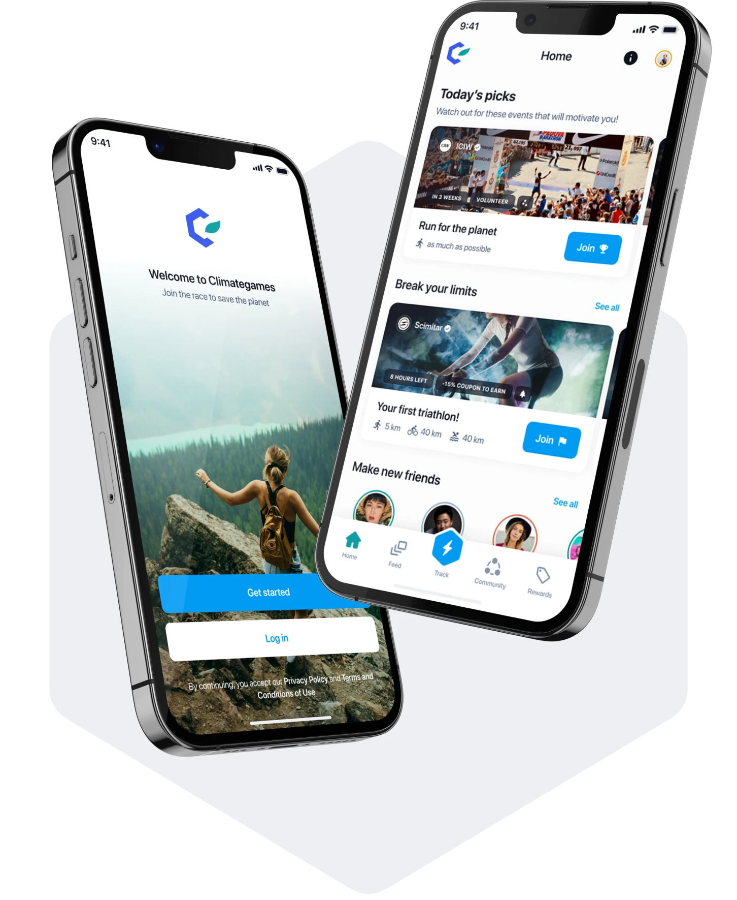
Climategames is a performance tracking app that offers so much more than other competitor apps.
You can create customized challenges, interact and compete with friends, create your very own in-app team or club and even earn rewards for your achievements in their very own independent marketplace. It is a must-have app for every sports fan and boasts advanced features you won't find on any other app.
The Challenge
Developing Climategames presented many challenges for AppTailors due to the long list of advanced features that needed to work seamlessly for the app to be successful.
In just 5 months we had to develop MVP of the mobile app available both on App Store and Google Play Store, and web app for business partners. The app also needed to be integrated with popular fitness products like Apple Watch and Garmin for people to be able to track their indoor and outdoor activities.
The SOLUTION
AppTailors was up to the challenge and even developed their MVP in just 5 months with a smooth user experience and Apple watch and Garmin integration.
We are constantly working on creating new features for mobile app users, as well as for companies using partner portal. We integrate with Garmin, Apple Watch, Polar, FitBit, Suunto and Wahoo. We created an app which has 5 star rating and has over 3 000 registered users. And the number is still growing.
Branding & Visual identity
Climategames is an offsetting-driven app which allows user and companies to create a real climate impact.
Creating visual identity and branding for climate positive app was a real challenge. We had to consider both individual and business users, mission, vision and values of Climategames. After conducting research, we knew that the direction we had to adopt was simplicity and consistency with earth colors, so as to stimulate the right brand associations.


Simplicity, coherence, earthy colors and a simple message - your physical activity can have a positive impact on the environment.
COLORS & TYPOGRAPHY
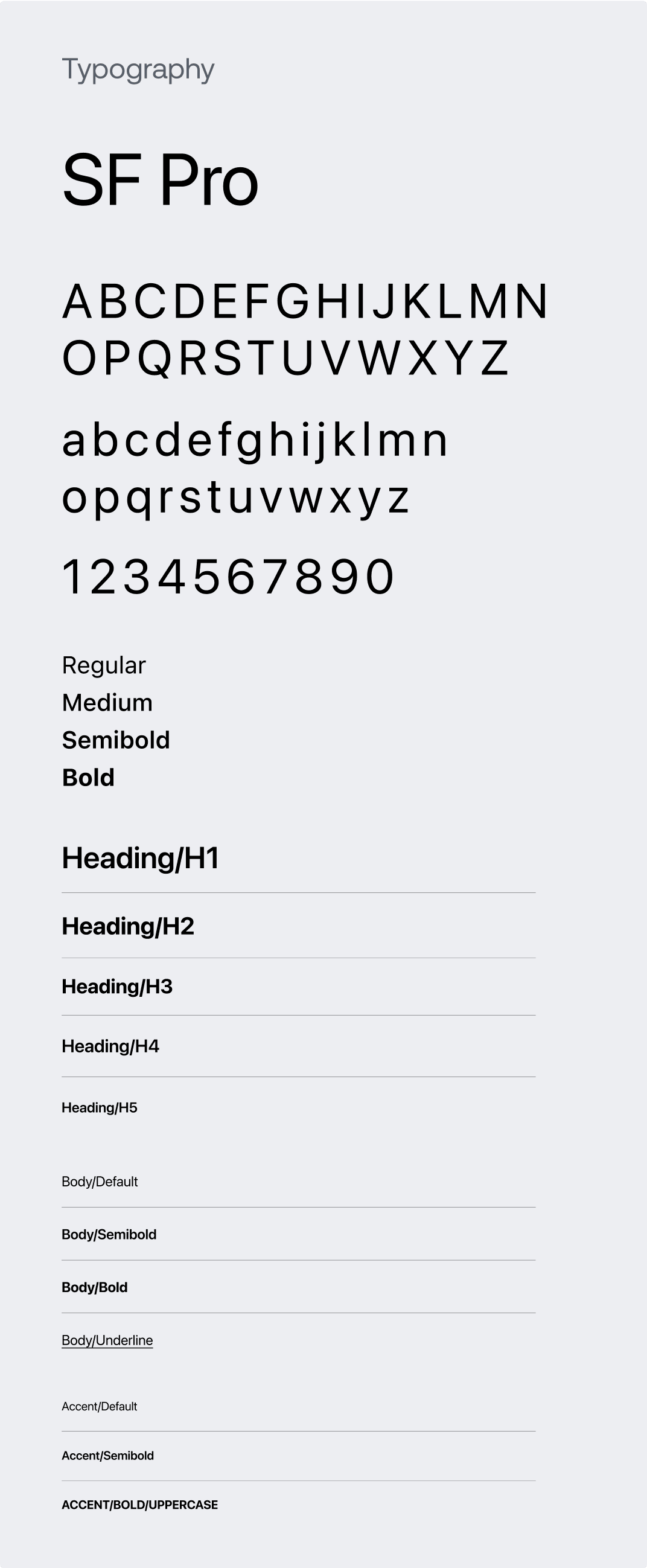
Choosing colors and typography is an inevitable stage of branding process. We took into consideration target group and associations connected with climate.
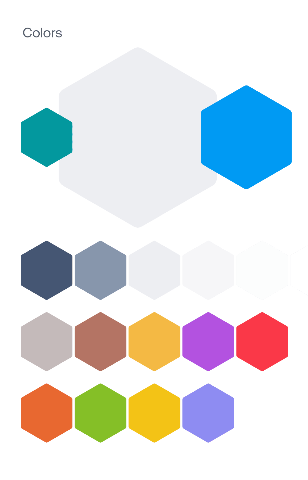
Our main focus on typography was to choose font, which will be equally accessible and readable on mobile app and web app. Primary colors had to combine simplicity and earth colors, that's why we decided to go with shades of grey, blue and green. Secondary colors where chosen to create contrast and allow design elements to stand out on mobile and web applications.
PRODUCT DESIGN PROCESS
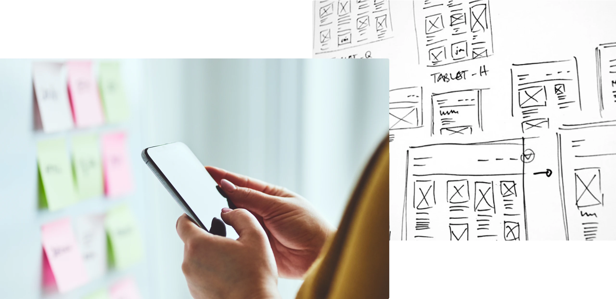
Our design process consisted of research, wireframes, customer journey map and user interface.
Our design process always starts with research. Understanding target group, user's behavior, their needs and goals is crucial. In case of Climategames it was even more challenging as we had 2 separate customer groups - sport lovers and corporate clients. Once we understood the needs and goals of both groups, we designed wireframes, user journey maps and them prepared user interface.
USER FLOW MAP
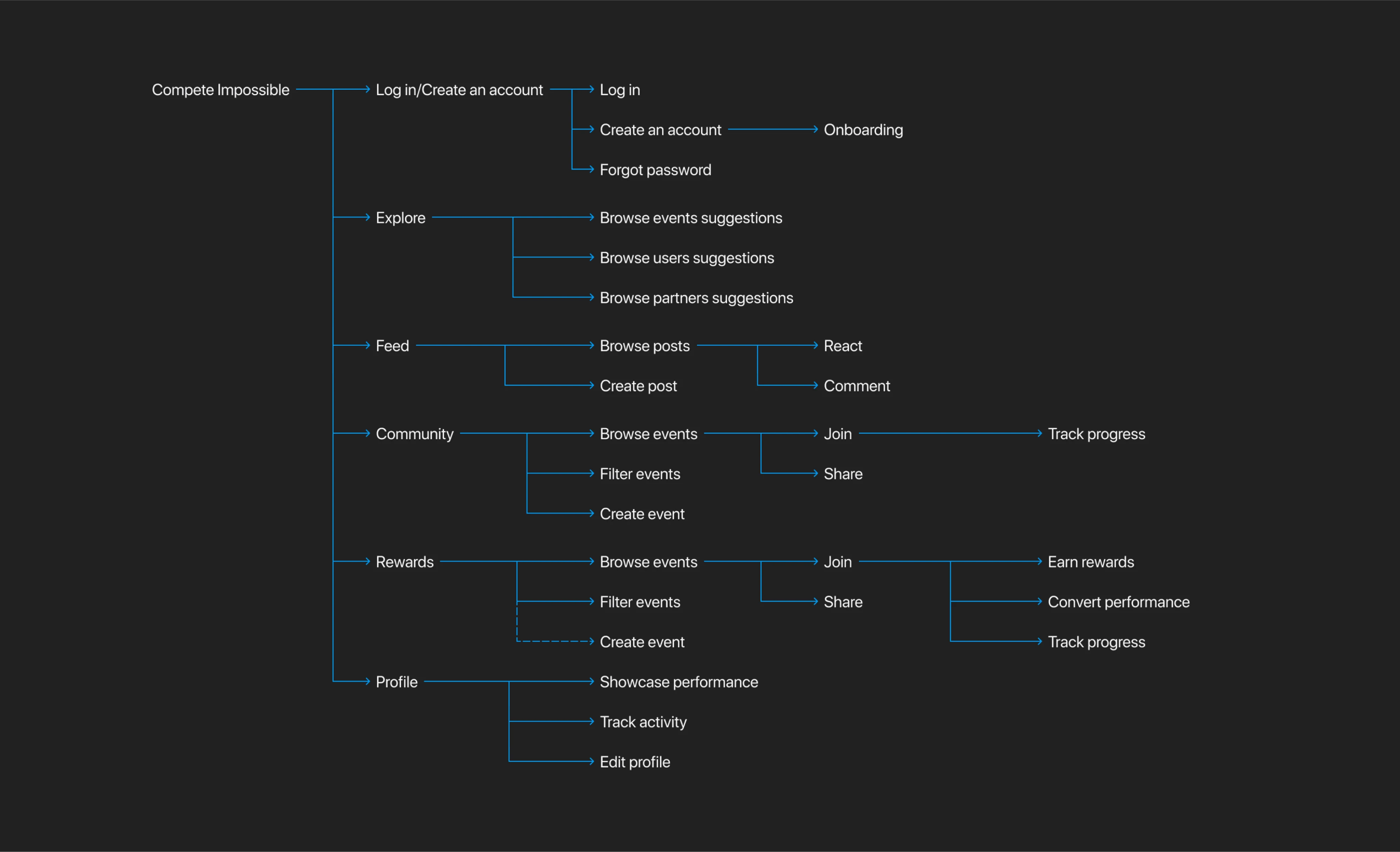
User Flow Map is also commonly called Customer Journey Map and it illustrates how users navigate through Climategames applications.
Climategames mobile app is designed to make impact through sport activities. We had to make sure that taking part in events, tracking activities and subscription flow is intuitive and simple. On the other hand, we had ensure equally easy flow for partners so they can create meaningful events which drive people to be active.
LIBRARY OF COMPONENTS
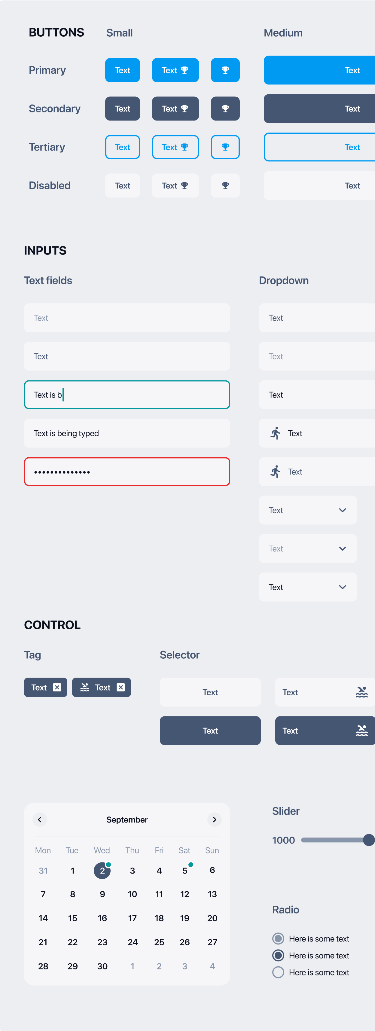
We always prepare design kit and library of components including buttons, inputs, icons, colors bearing in mind various screen sizes.
Consistency of our designs is as crucial to us as quality of code we are writing. For Climategames we have prepared a library of components which includes nearly 300 elements. We have prepared variations of icons, buttons, inputs, assets and colors to be used when developing new features.
UI ELEMENTS
We have created a wide range of reusable elements, which can be used in the development of new features, or any changes in order to maintain consistent design of Climategames mobile app and web portal.
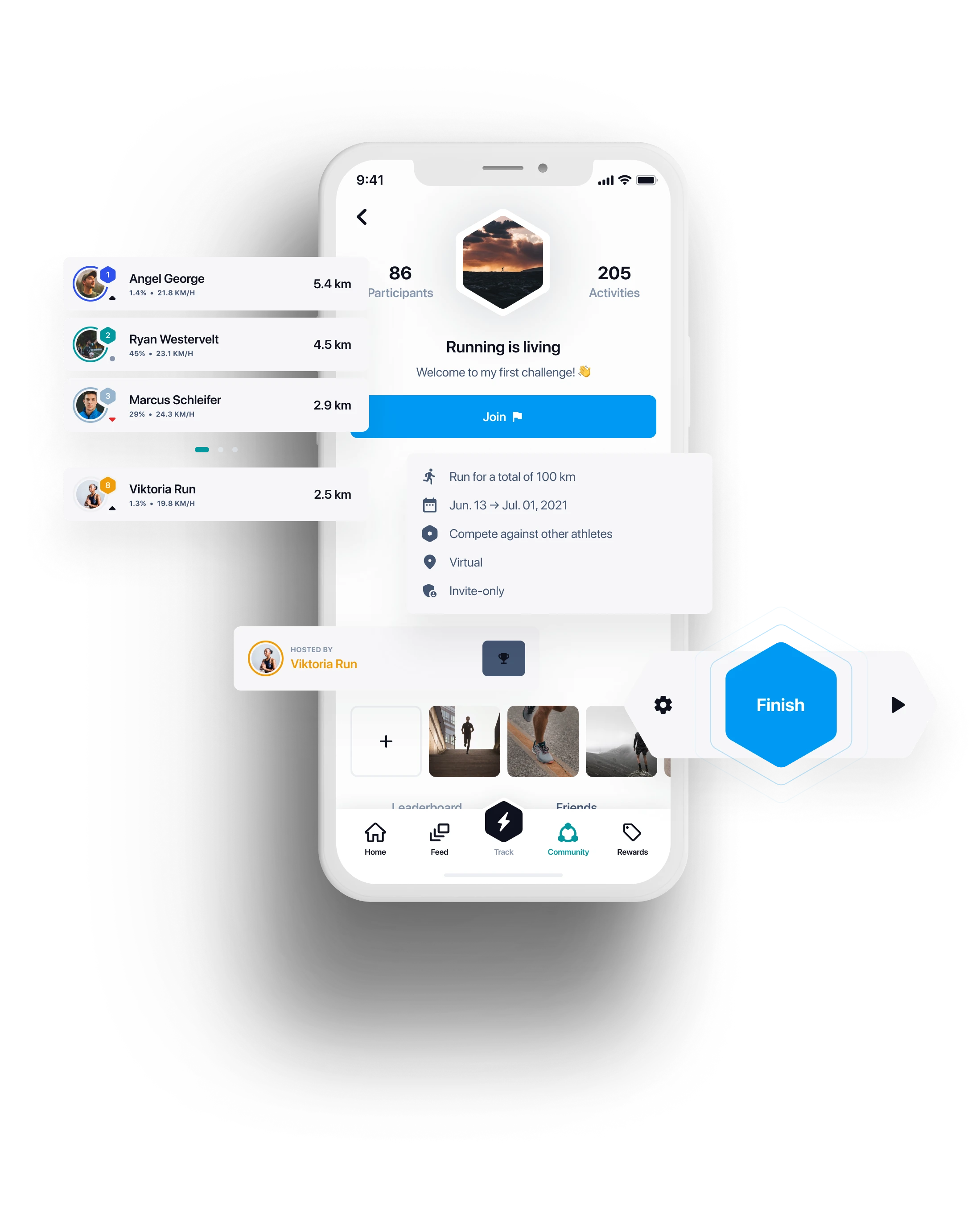
Developing Climategames presented many challenges for AppTailors due to the long list of advanced features that needed to work seamlessly for the app to be successful.
WHAT IS IT ALL ABOUT
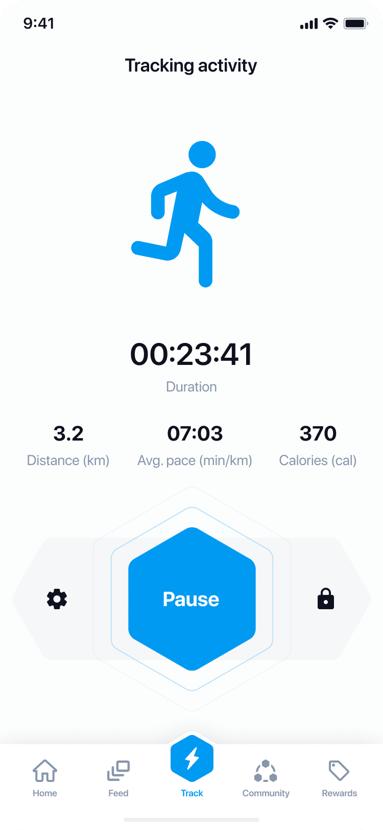
Climategames offers impact positive solutions to sport lovers and climate heros. Idea is simple - take part in events, be active and plant tress, remove plastic or reduce carbon footprint.
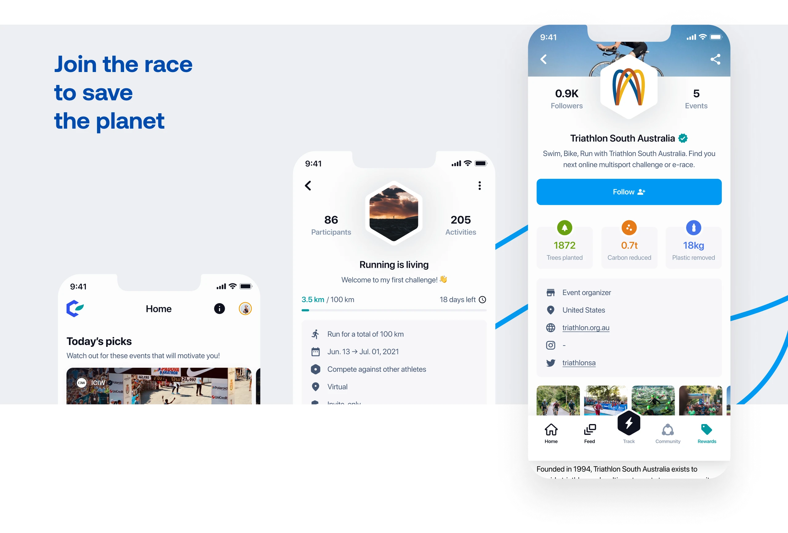
Mobile app allows user to take part in various events created by partners. By tracking activities, users can make real climate impact. Thanks to blockchain technology we can track areas where trees were planted, plastic was removed or carbon was reduced. Users can follow each other, react to the newest activities which are published on newsfeed or boost their impact thanks to subscription model. Events are created by partners on partner portal, they can be open to public or available only to closed group.


MOBILE SCREENS
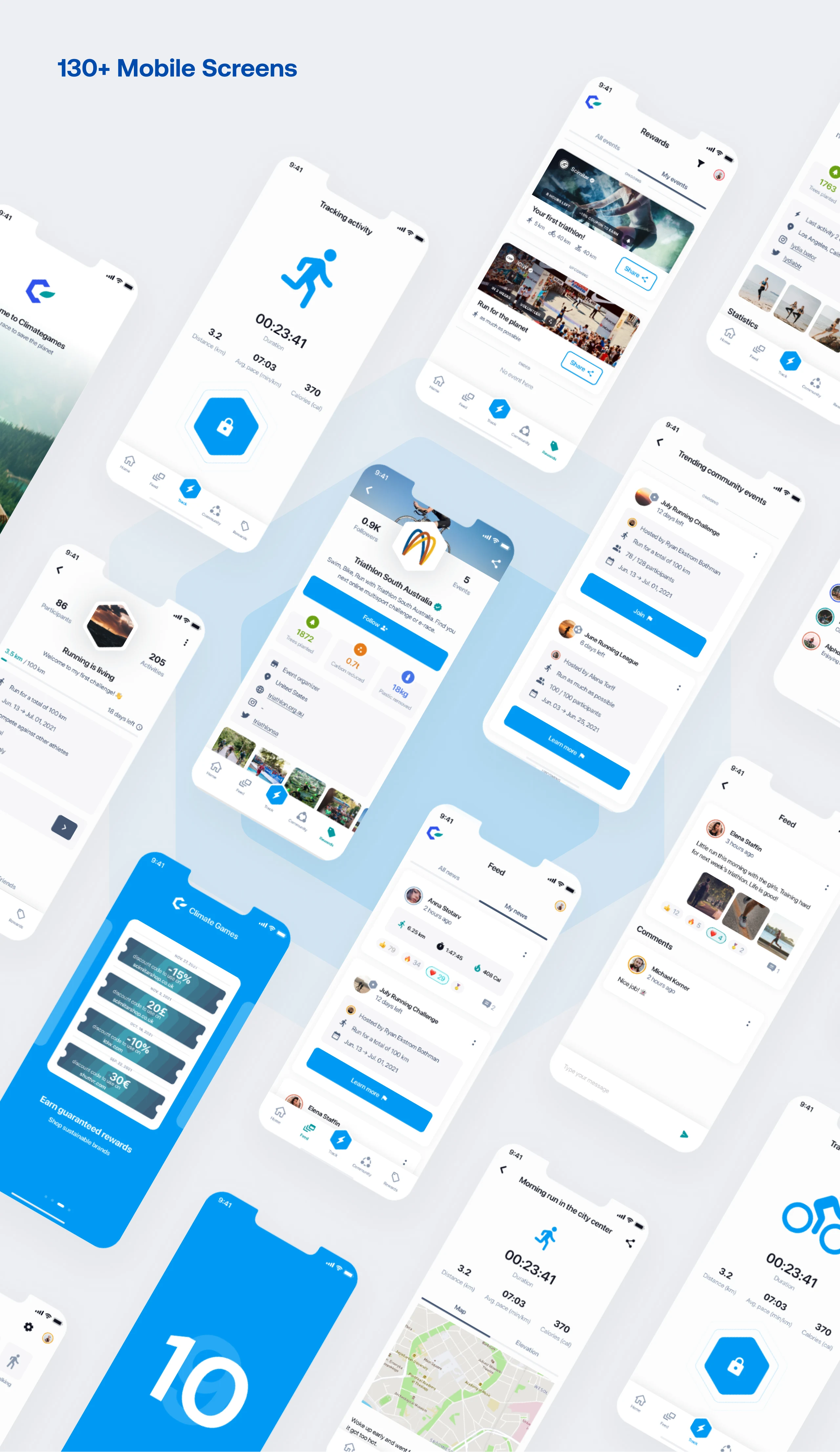
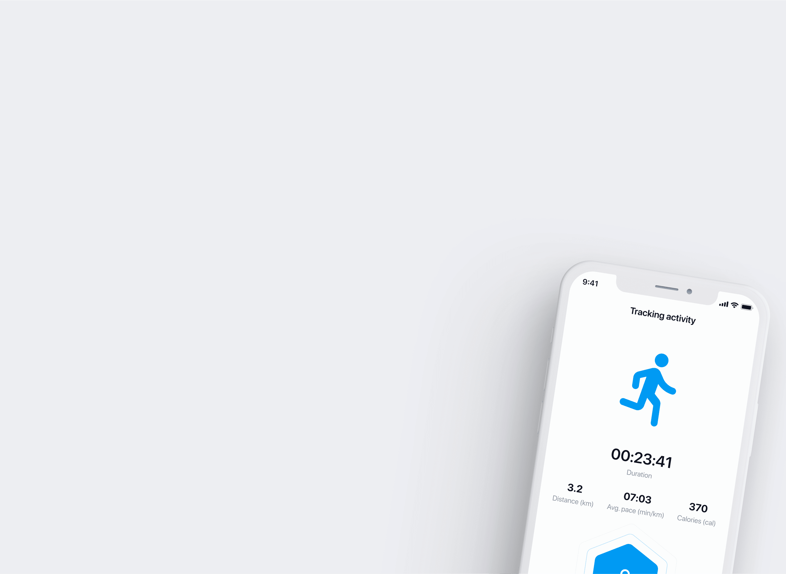
Our app is developed in Flutter, therefore in a short time we were able to release MVP to both App Store and Google Play Store.
At the initial stage we have prepared more than 130 mobile screens, and since the launch of the app we doubled this amount. Our main focus was and still is on intuitiveness, simplicity and very clear user journey.
PARTNERS DESKTOP APPLICATION
Designing and implementing portal for B2B users.
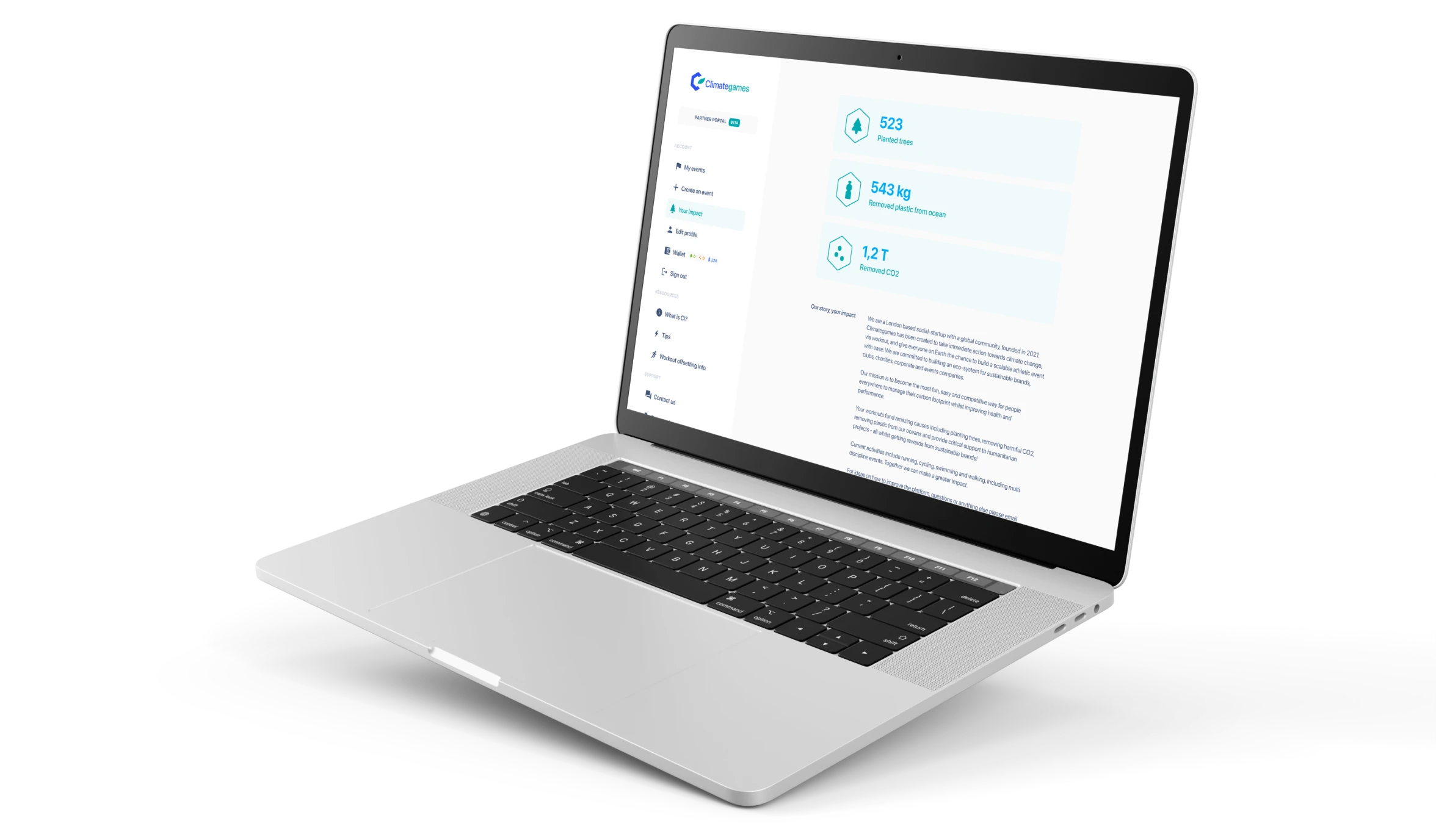
On top of mobile app, we had to create partner portal allowing companies to create branded events for their own employees or open to public, purchase subscriptions or sign up for workshops. We had to make sure that design is simple, so the portal is incredibly easy to navigate.
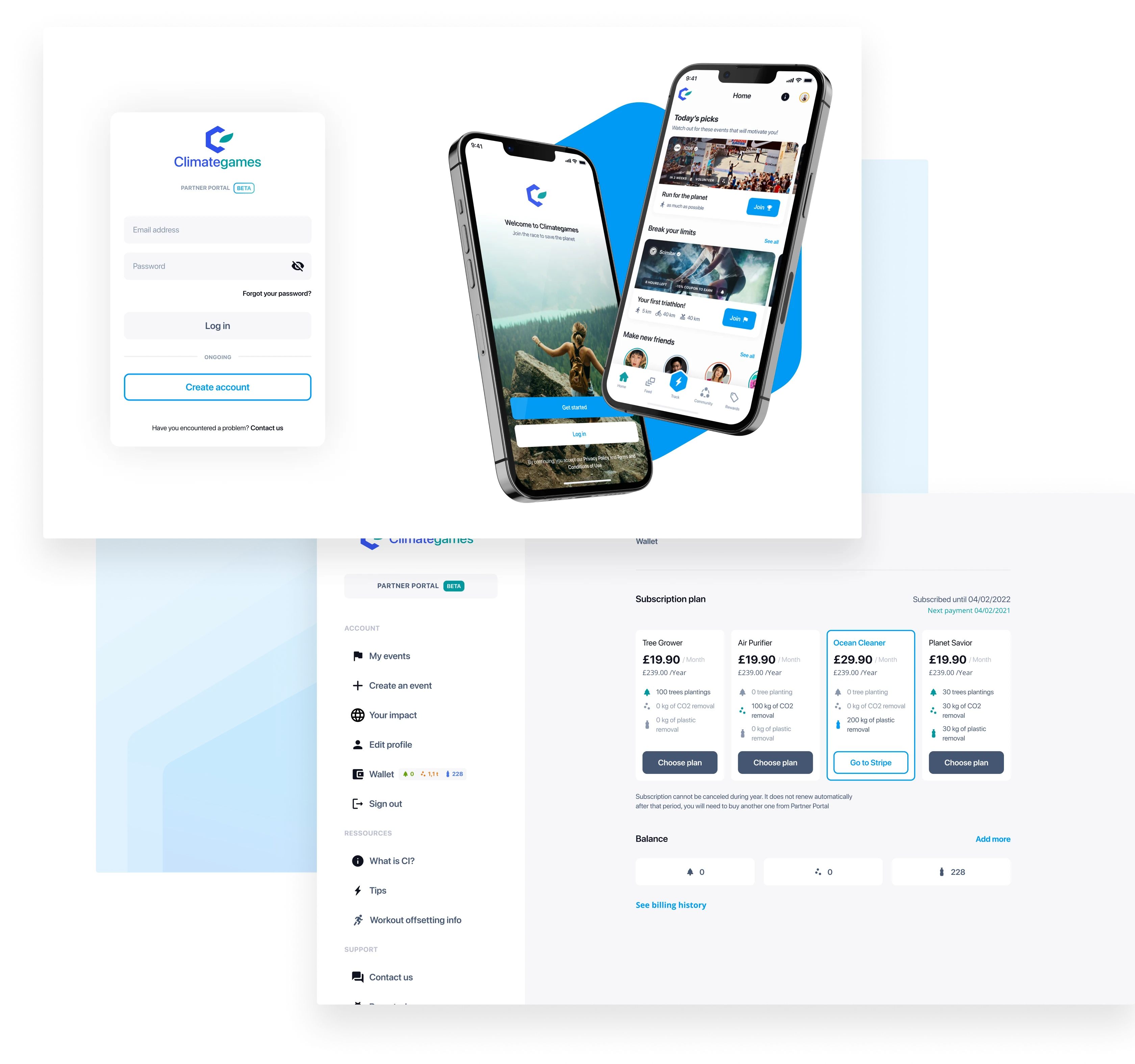
WEB SCREENS
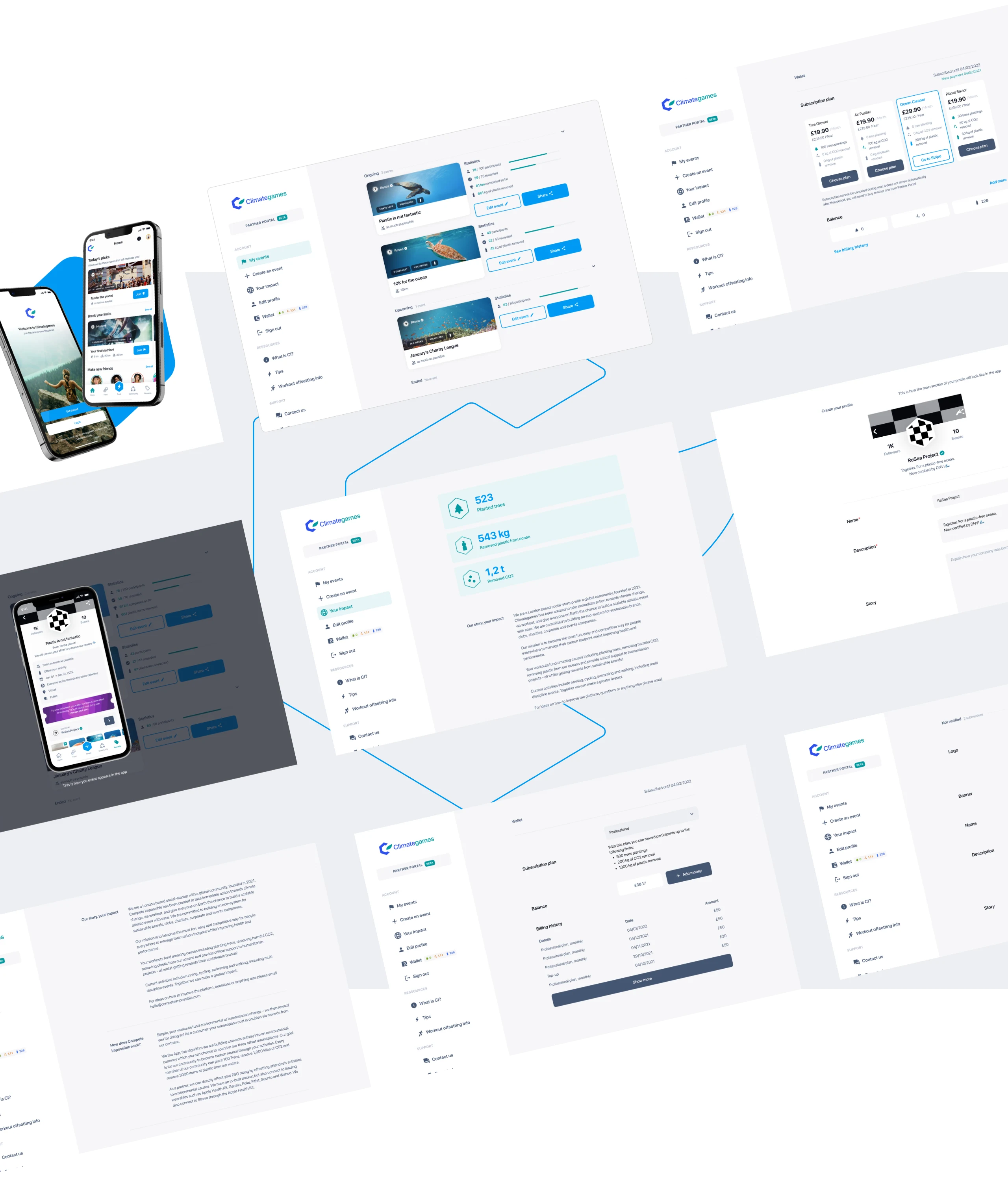
Main goal of designing the web screens for partner portal was to keep consistency with mobile app.
To develop partner portal we used the same UI kit and library of elements as in mobile app to provide users with seamless experience. We know how important to companies is simplicity and easy-to-navigate web app. We are constantly upgrading designs and app with new features and possibilities so they can increase environmental impact.
STATISTICS
Just a short summary in numbers of our results.
Hundreds of thousands of session, thousands of users, countless hours spent on conversations and new feature ideas. 5 months to create MVP and still ongoing cooperation building up new features every month.
Sessions
Months to MVP
Countries
Watch integrations
Team
Mobile Screens
![[object Object] icon](https://res.cloudinary.com/apptailors/image/upload/q_auto,f_webp,fl_any_format/v1664284946/climategames/Property_1_1_Property_2_Click_zruncl.svg)
![[object Object] icon](https://res.cloudinary.com/apptailors/image/upload/q_auto,f_webp,fl_any_format/v1664284946/climategames/Property_1_2_Property_2_Default_easjn2.svg)
![[object Object] icon](https://res.cloudinary.com/apptailors/image/upload/q_auto,f_webp,fl_any_format/v1664284946/climategames/Property_1_3_Property_2_Default_eon0qu.svg)
![[object Object] icon](https://res.cloudinary.com/apptailors/image/upload/q_auto,f_webp,fl_any_format/v1664284948/climategames/Property_1_4_Property_2_Default_kjtjnd.svg)